Margin- white space on the outside of the page. Vertical space next to the columns.
Column- Block of text which is the same width (does not have to be justified)
Alley- space between columns
A multiple column grid helps the reader travel through the page of text. It also helps the text appear more legible to the viewer.
Many people use 2 spaces in word processors after a period but the correct amount of spacing is 1. There is no need for 2 spaces, it just creates holes in the text.
Characters- letters, numbers, spaces, punctuation
70 characters are optimal for a single line (5-7 words)
Baseline grids are used in order to lock the text in place, the grids help to line up separte columns and align the entire page of text.
typographic river- when a colum is justified, spaces are added in between the words to line up the edges of the column, these spaces are called typographic rivers because when you look at them all together they flow from 1 line to the next.
white space and negative space are very positive aspects to a layout, they can help create closure, as well as make a more interesting layout and design.
Color can be used in a number of different ways, color fields as well as colored text
texture is classified as size, font, color (many aspects which can make a design appear more interesting)
Widow and Orphan- the single last line on the next page from a previous paragraph, or the last single word on its own line.
inch marks-straight flat diagonal lines used when abbriviating inches
quotes- curved lines, sometimes with a heavier end on one side
ways to start a new paragraph- indent, extra space between lines (keep is consistent throughout layout)
Sunday, December 7, 2008
Wednesday, November 12, 2008
Helvetica: the movie
I was surprised when we watched Helvetica the movie because I really learned new things about an extremly popular font. I never realized that Helvetica was used so often and on so many recognizable logos, signs, and paperwork. It's interesting to me that such a plain and simple typeface became so well known and is still used after many many years. I'm not sure that if someone designed the font of Helvetica today that it would be quite as popular.
Monday, November 10, 2008
Neville Brody: A New Point of View

Many people can argue that there are thousands of graphic designers and typographers in existence today. Though a person may have formal training on a Mac computer, and a degree from a University, there are very few graphic designers who can even come close to comparing to the skill and talent of Neville Brody.
Neville Brody was born on April 4, 1957 in North London England. His formal training began in 1975 when he studied painting at Hornsey College, following this education he attended the London College of Printing from 1976 until 1979 where he studied graphic design. Although his formal training took place at well known colleges and universities, Neville Brody did not enjoy conforming to society and therefore was nearly kicked out of his school several times. The reason a formal education did not seem to work for Brody was because he has a developed style with a punk and urban feel, which they did not agree with in the late seventies. One of his earlier projects showed a postage stamp with the head of the queen turned on its side. This was viewed as very disrespectful, especially in London. Shortly following his formal education at the London College of Printing, Neville Brody designed numerous record covers and was extremely interested and intrigued by the musical world. Following his “musical” career , Neville Brody became the Art Director for the magazine face. Due to Brody’s early input into the newly launched magazine, his influence was carried through the magazine for years and his style was originally portrayed. After his career at face magazine he was the art directory for the men’s magazine named Arena, as well as City Limits, Per Lui and Lei (which was based out of Italy) of the Conde Nast Publications in Milan, and Actuel magazine (based out of France). In 1987, following his Art directing years, Neville Brody opened his own design firm called the Studio in London, England. Through this corporation Broday had the opportunity to design for numerous well known companies such as; Nike, Premier TV, the house of world culture in Berlin, ORF, Deutsches theatre in Hamburg, Parko department store in Tokyo, and the Digital media publication of “fuse.” Overall Neville Brody has a realistically fulfilling life with encompasses the entire world. Neville Brody’s style is very unique and extremely uncommon for his time. During the years with he was most innovative (late eighties and early nineties) the world had never seen anything quite of this sort. His urban yet graphic style was new an intriguing to people. Some did not appreciate his new form of art but others enjoyed the risk which he took and wanted to use it as their own. He pioneered many of the abstract styles we use today. His use of bright colors and graphic shapes and forms makes every composition visually pleasing and enjoyable. When observing some of his designs, the viewer at first sees the overall artwork, not the individual pieces. As an “artist” Brody is successful in his abstract strategy to his viewers. Today this type of style may seem overdone, but during this time there were very few people who were willing to take a risk on a style which had never been done before. His graphic design talents and unique urban style reached new heights when Neville Brody began to design type faces.
Neville Brody designed and created many typefaces, some which are highly successful today while continuing to show his own style and strengths through every character. The typefaces which Neville Brody has designed are: Arcadia, FF Autotrace Double, FF Autotrace Five, FF Autotrace Nine,FF Autotrace One, FF Autotrace Outline, FF Blur, FF Dirty Four, FF Dirty One, FF Dirty Seven One, FF Dirty Seven Two, FF Dirty Six One, FF Dirty Three, FF Dome Headline, FF Dome Text, FF Gothic One One, FF Gothic One One Condensed, FF Gothic One Two, FF Gothic One Two Condensed, FF Gothic Two One,FF Gothic Two Two, FF Harlem, FF Harlem Slang, Industria Inline, Industria Solid, Insignia, FF Pop Led, FF Pop Pop, FF Tokyo One, FF Tokyo One Solid, FF Tokyo Two, FF Tokyo Two Solid, FF Typeface Four One, FF Typeface Four Two, FF Typeface Seven, FF Typeface Six, FF World One, FF World Three andFF World Two. Although Neville Brody created many different typefaces, there are three which stand out from all the rest: Arcadia, Insignia, and Industria.
Originally the Font Face Arcadia was designed for the Banner for Arena Magazine to be used for the title on the covers in 1986, but in 1990 the company Linotype released the font to the public. Arcadia has since proved to be a very successful font; it is used often for titles and in advertising. The structure of each character is extremely unique. Each letter uses a thick stroke as well as a thin stroke. This font has been known to have a very elegant look when used properly, although if used in a size smaller than 24 it becomes difficult to read for the viewer. The font’s style is long and tall, with pronounced ascenders and descenders. Personally this font appears to portray a handwriting style, with and higher level of sophistication and elegance, which has been influenced from the Art Deco Era.
The Font Industria was also originally created for a purpose other than for use by the public. Originally Industria was designed for the magazine called “The Face.” Although this font is simple and geometric it would not be suggested to be used in an entire body of text for legibility reasons. Industria appears to follow a mathematical formula while including geometric shapes and forms. This sans serif font has characters which are a single width throughout as well as unique bases. Some of the bases of the characters are at slight angles which descend below the baseline (the line where all of the letters sit). An interesting point about this font is that only essential parts of every character are used, because it is only necessary for the viewer to see important parts of a character to be able to easily identify the letter. The font Industria also has a unique hollow style of the font. In addition to the solid style of Industira a closely popular style of the font is the same monowidth letters but with a thin white stripe down the middle of every character. Personally to me it seems that this style of the font would be incredibly difficult to read in a small font and could not be used for anything but a large title.
The third Neville Brody font which has proved to be very popular for numerous different reasons is Insignia. This font conceptually does not make sense because of its round and sharp edges put together in strange manners. For example, one would expect that the bowls of the letter S would be round but instead at every turn in the character there is a sharp edge. This font, like the others, was created for a separate purpose then from how it is currently being used, but was originally designed as a headline font in 1986 for Arena Magazine. Since its release to the public in 1989, Insignia has become a highly desired font. This font is simple with unique twists and can easily be read in many different sizes. Although this is a san serif font, the letters E, F, and Z all contain a unique half serif (which appears to be similar to a beak of a letter more than that of a serif). This font is also a monowidth font with some rounded outer corners as well as some extremely pointed edges and turns. Insignia could quite possibly be Neville Brody’s more popular and successful font not only of all of his fonts but in the world of fonts.
Neville Brody’s peak in fonts was during the late eighties and early nineties although he continues to work, design and create today. During the 80’s and 90’s Mac computers were a desirable form of technology, similar to the way things are today. Neville Brody describes his style when designing fonts by telling an interviewer that “Like everyone, I have five or six applications open at the same time and I’ll be dragging stuff from window to window. I drag stuff from Photoshop into Freehand, do some interesting things with outlining, drag that into Fontographer, publish that as a font and use the font back in Photoshop.” It seems interesting that an extensive amount of thought and planning contributes to the designing of a single font. During this time the computer became very popular and Neville Brody as a designer needed to use the compute to his advantage and not in a hindering manner. Learning to work with a computer and not against it is a difficult task although through exploration and patience Neville Brody and his entire staff is using modern technology to their advantage.
Tuesday, October 21, 2008
Beak
BEAK: A beak is a type of decorative stroke at the end of the arm of a letter, connected to the arm by the terminal. Similar to a spur or serif, it is usually more pronounced.
ZT
http://graphixdesigns.blogspot.com/2008/02/parts-of-typefaces.html
BEAK: Similar to a spur. A beak can be found on the characters L,T & E.
http://philiplikens.com/stuff/dottype.swf
ZT
http://graphixdesigns.blogspot.com/2008/02/parts-of-typefaces.html
BEAK: Similar to a spur. A beak can be found on the characters L,T & E.
http://philiplikens.com/stuff/dottype.swf
Monday, October 13, 2008
Neville Brody
 www.idtifont.com/similar?1DW
 www.typogabor.com/lnuit-Jeremy-Tankard/
Neville Brody:
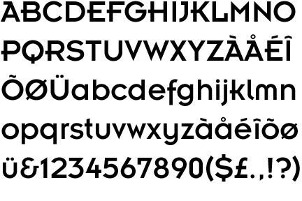
Fonts designed by Neville Brody:
Arcadia
FF Autotrace Double
FF Autotrace Five
FF Autotrace Nine
FF Autotrace One
FF Autotrace Outline
FF Blur
FF Dirty Four
FF Dirty One
FF Dirty Seven One
FF Dirty Seven Two
FF Dirty Six One
FF Dirty Three
FF Dome Headline
FF Dome Text
FF Gothic One One
FF Gothic One One Condensed
FF Gothic One Two
FF Gothic One Two Condensed
FF Gothic Two One
FF Gothic Two Two
FF Harlem
FF Harlem Slang
Industria Inline
Industria Solid
Insignia
FF Pop Led
FF Pop Pop
FF Tokyo One
FF Tokyo One Solid
FF Tokyo Two
FF Tokyo Two Solid
FF Typeface Four One
FF Typeface Four Two
FF Typeface Seven
FF Typeface Six
FF World One
FF World Three
FF World Two
British Designer
Tuesday, September 23, 2008
Greek Alphabet


In the beginning, the greeks originally started their alphabet system with two characters: the aleph and the beth. It may seem obvious, but over time these two words were combined together to form the word "alphabet." About 800 BC the Greeks had a fully developed letter system with later became the basis to other languages such as Hebrew and Arabic. Unlike Hebrew and Arabic (which are read from right to left) and unlike English (read left to right, haha like you didn't know!) greek words were originally read in alternating directions. It may seem interesting that this is the OLDEST language, and it is still used in many modern day situations (math and science problems, sororities and fraternities, names of stars...)
Question: What other languages did the greek language influence?
http://http://www.craftcuts.com/imagesb/stencils/sets/greek-letter-stencils-lg.gif
Sunday, September 21, 2008
Vocabulary
Absolute Measurement: fixed value, finite terms which cannot be altered
Relative Measurement: measurements which depend on the letter spacing, CAN be altered
Point: unit of measurement for a font. refers to the height of the type block
Pica: 1 pica=12 points. 6 pics=72 points= 1 inch
Em: unit used to measure spacing (letters a smaller so is the spacing)
X height: height of a lowecase "x" key refrence point
Tracking: amount of spacing between the letters
Letterspacing: space between letters increased
Kerning: space between letters is reduced
Leading: space between lines of text in a text block
Dashes: short horizontal rules
Alignment: position of type within a text block (left, centered, right, justified)
Wordspacing: controling the space between words
Widow: lone word at the end of a paragraph
Orphan: final or two lines separated from a paragraph by new column
Indent: some lines or one line is moved in or out away from the rest ( first line, running, hanging, on a point)
Tuesday, September 9, 2008
BASKERVILLE & FRUTIGER
John Baskerville was an extremely unique man. Most people today know him as the creator of the Baskerville font, but his interesting occupation and hobbies before his clame to fame is very interesting. Starting out John Baskerville was a stonecutter and an english writer. His stone cutting skills led him to a job in engraving headstones which later became letter design (which he is more well known for). As a letter (font) designer Baskerville's font is well known for it's differing line weights and modern style.
http://http//www.infoplease.com/ce6/people/A0806405.html
http://http//www.myfonts.com/person/baskerville/john/
Adrian Frutiger is one of the most well known printers and font designers. Starting at a young age Frutiger was exposed to the design world by working as an apprentice for a printer in his home city. After an education beggining in Zurich and concluding in Paris, Adrian Frutiger wrote many books about typesetting and letter design as well as created his own fonts (most of which are very well known today. The font Univers is one of Frutiger's most well known fonts. This font is unique and important because of it's versitility and differing weights and styles.
http://http//typophile.com/node/12118
http://http//www.myfonts.com/fonts/linotype/univers/
Baskerville Font:

Tuesday, September 2, 2008
Grids

As a viewer a grid is not something that first comes to mind when looking at the layout of a page, but as a designer it becomes very apparent when a grid is used to organize and create an order for the information on a page. A grid is an invisible guide to help designers create visual interest without allowing focus to drop and maintain organization.
Tuesday, August 26, 2008
Who is Paul Rand?


I have to admit, when I was first asked "who is Paul Rand?" I honestly had no idea. After a quick google search my eyes were opened to Mr. Rand's amazing creative world. He was a man of many talents. The art director at Esquire magazine and Apparel Arts, a Magazine cover designer, the creator of some of the most famous corporate logos, and finally a teacher at colleges and universities. His work is simple and the colors and lines are crisp. Paul Rand is the creator of the famous UPS, IBM, and CBS logos, as well as the co author of childrens books with his wife Ann. He believed that working for free helped to produce more honest art that came from the heart instead of working solely for monetary pay. His style uses a combination of cubism and constructivism influences as he created a unique American graphic language. As I watched a short video which displayed some of Paul Rand's work an interesting quote which he said struck me. "Don't try to be original try to be good." To me this seems slightly strange because Paul Rand's work has such a unique and original style to it, as he was the only one of his time to design such works.
Subscribe to:
Posts (Atom)
