Tuesday, November 3, 2009
Monday, November 2, 2009
Girls Inc images

Some Girls inc inspiration. These 2 images are very different from their website and girls inc merchandise. Although the red is used through out their website and PSA announcements and I believe it's safe to say it's their "common thread", the style in which this image is made is very different from the rest of the promotional material. The textures used give a different feel that is not a streamline and clean. The image below of the tree with the faces in circles is much more illustrative that anything that I've noticed when promoting Girls inc. This is a positive direction for this organization to go because it relates more closely to young girls.

Sunday, October 11, 2009
Monday, September 28, 2009
Wednesday, September 2, 2009


Thursday, May 7, 2009
May 4
I think EVERYONE, not just people in the creative field should reflect on these 100 ideas. This list is so cute, but actually made me think about my life. I really don't stop to enjoy the little things in life and those sometimes are the most important. To me just by walking to class helps me to notice different things in my surroundings. Every once in a while I'll try to take a new route to my class or when I'm walking home, this way I give myself the opportunity to enjoy something new. I also always try to keep a camera with me at all times, that way if I see something that I like or something that inspires me then I can document it!
April 28
After watching shift happens on Youtube it really made me think. Besides the obvious shocking facts that were flying at me, I was thinking about the typography. I think this might actually make me a nerd, but it was really cool the way the movie used a page from a newspaper when it talked about the new york times, and used the google search bar when stating facts about google. It's also so amazing to think about how quickly our society is moving and how rapidly our country is growing. on the flip side, it's kind of unfortunate to think about all the material that we're learning now and how quickly it will be outdated.
Tuesday, April 21, 2009
Friday, April 17, 2009
March 3
"Graphic design can be a contribution to our audiences"
"That only through change can we continue to push ahead in knowledge and expertise, theory and expression, continually building our collective knowledge of the process of communication. These convictions were formed early and sustain me today."
When this new type of design emmerged it was exremely controversial. No one had ever seen anything like it before and therefore people disliked the new style. This does not seem fair to the designers who searched and attempted new solutions to their problems. Everyone is always trying to search for something new, but are we now limiting people to solutions within parameters?
Feb.24
I never realized how important writing skills are especially as a designer. A designer not only have to make their work visually appealing but the piece also has to flow and have good grammar and sentence structure. This might be difficult for some people to understand why a designer would need to have good writing skills. The layouts that the designer makes might be beautiful while the wording is not as fluid. Many audiences who view the work of designers are not trained to look are the visually quality of the work but will immediately catch a spelling error.
Thursday, April 16, 2009
Monday, April 13, 2009


Friday, April 10, 2009
Design Observer Articles
Thirteen ways of looking at a Typeface...Michael Bierut worked for a designer who limited his usage of varying fonts to 5. When Michael left this job and ventured into the world of Graphic Design on his own, he went crazy and exerienced a font OVERLOAD! Every typeface seemed so new and beautiful, but after his initial high on "type" he realized that there are 13 ways of looking at a typeface. Why do you chose the font that you do?
1. Because it works
This rule seems the most logical to me of all the rules. Why not use it if it works and it's successful!
3. Because you like its name
This one I have found to be very true. Sometimes when a font has a catchy name or a familiar title, it is much easier to use that particular font for a project.
13. Because you can't NOT!
This rule was the funniest to me...it's so true!
Tuesday, April 7, 2009
Design Matters
"what is your first memory of being creative?"
Debbie Millman is a host of a talk show which interviews designers. On episode that I listened to she was interviewing Meira Kalman who is a designer and illustrator.
"Serendipity of the world"
Design matters is a talk show where designers and other people in the creative field are interviewed on their life stories and design in the world. Debbie Millman, the hostess, is very likeable and seems easy to talk to. It seems like the guests on the show enjoy her company, and feel comfortable talking about everyday life situations with her. When I first started listening, the introduction was monotone and a little long, I was afraid that the entire interview was going to be like this but I was pleasantly surprised when the conversation became more lighthearted.
"AH HA moments"
Thursday, March 26, 2009
Tuesday, March 3, 2009
Monday, February 9, 2009
Trollback
"being happy while experiencing design"
"Comfort-----Contentment------Joy------Delight------Bliss"
"Being happy designing"
"The visualization of happiness"
"Three designs that made me happy"
-New Subway instructions (have fun, do not hurt people, do not accecp defeat, strive to be happy, do not hold grudges) [sometimes you can stare at something for a very long time before you realize it's actually not what you think it says]
-Building with retractable roof (it makes you look at the colors of the sky and really pay attention to somethin you might not have noticed before)
-empty speech bubbles
Thinking about ideas and content freely-with the deadline far away
working without interruption on a single project
using a wide variety of tools and techniques
traveling to new places
working on projects that matter to me
having things come back from the printer done well
"Everything I do always comes back to me"
"Worrying solves nothing"
"having guts always works out for me"
The things that he discussed are the the problems that people don't take the time to think about in everyday life.
Journal 3
Trollback created a great image for CBS. Although the recognizable symbol of the "eye" had already been created, the new campaign is captivating much larger audiences. The symbol of the eye is very simplistic but is bold and original. After viewing clips of how the text is laid out in addition to the symbol, it is clear why this network is so successful. The versitiliy of the logo is beyond many other networks, this symbol serves as an icon, a trademark, the period to the end of sentences and as a main logo.
Tuesday, January 27, 2009
Journal #2

Capture accidents.
The wrong answer is the right answer in search of a different question. Collect wrong answers as part of the process. Ask different questions.This rule to me seems like something which can be very beneficial in everyones lives. We as humans are trained to do the "right" thing and understand the consequences if we travel down the "wrong" path. With this specific rule it allows people to understand their mistakes... and embrace them. Who knows, your biggest "flaw" may really be your greatest attribute. When I am working on a project, it is often difficult for me to take risks because I am afraid of doing the wrong thing or resulting in the incorrect answer. Many times a different idea can lead to a totally new and in some cases even better than the original.Sunday, January 25, 2009
GD Reading #2
Who? What? Why?
These are some VERY important questions to answer but unfotunatly are OFTEN ignored!
"A Logo is a shortcut"
-I loved this saying because it really is so true, a logo is a lazy way of judging a compand, network or product. I know when I go shopping if I like the packaging of a product I am more likely to pick it up.
"A Logo is not a magic lantern"
-This is funny becuase some might think that a logo can be a tell all, but in reality it's just a taste.
Process of Memory:
1.See shape and color
2.historial understanding
3.use known information to infer
4.Mnemonic Value
Don't be Trendy, It's more important to design for Longevity
"Good designers make trouble"-Tibor Kalman
Our Face is a mask...we only see what we want to see. Why do we see ourselves as a simple outline but see others as a detailed reality?
Tuesday, January 20, 2009
Journal 1


Who is Chip Kidd? Chip Kidd seems like a really interesting designer to dicuss things with. His book covers usualy include an intricate photo along with very large type. To me his style is not appealing but I do believe that the way in which he creates book covers, and writes books for that matter makes him unique in the design world. It's nice to come across a designer that can understand the frustrations of an author and know the all around issues with publishing books. I belive that he can really use these tools to his advantage when designing covers over many other book cover designers.
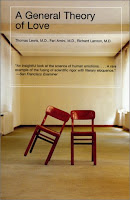
John Gall is also an interesting book cover designer. Although I found his covers more appealing to my eye, the covers did still seem slightly busy. Each cover was designed around a photograph with a geometric solid shape covering an eye or bottom half of a face. There was one cover of his that really caught my eye, the cover with 2 chairs leaning onto eachother. His style is also very interesting but I did not like that in his interview he said he didn't read the entire book. I can understand how this would be difficult to read EVERY book that you designed a cover for but to me that doesn't seem like something one would openly share.
Graphic Design Reading #1
When I first started reading this I thought to myself...UGH this is going to be so long! But once I actually read the first page I was totally captured. What is semiotics? It's the theory of signs, putting something into a context Ex: Sneeze_Cold
"The window of the soul is the mouth" -Everyone always thinks it's the eyes but it really depends what you're looking for!
RULES:
1.answer who what why?
2.Identify, don't explain
3.Understand Limitations
4.Be seductive
5.make mnemonic value
6.pose a question
7.Design for longevity
8.make the logo the foundation of a system
9.design for a variety of media
10. Be strong
(I loved these rules and I thought that when my spirits were down in the future I can refer to these points)
Subscribe to:
Posts (Atom)
